

The Challenge
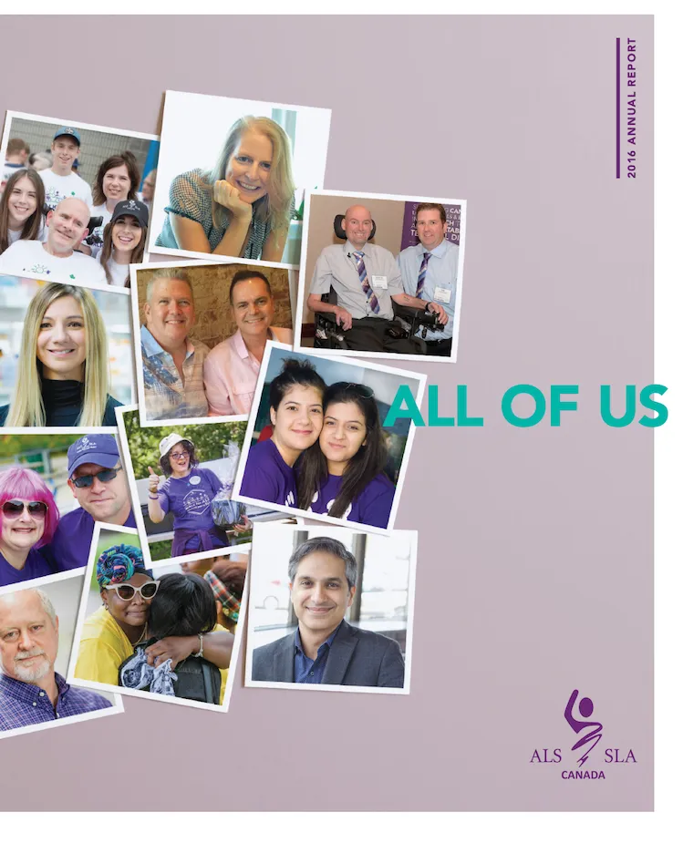
ALS Canada’s brand hadn’t been built; it had accumulated and evolved. A fragmented identity had taken shape over time, and everyone in the organization carried a slightly different version of it depending on their role and their connection to the cause.
The result was an organization that meant different things to different people, with no documented personas, no common language, and no cohesive system. For a national nonprofit competing for donor dollars, volunteer engagement, and research funding, that inconsistency had real strategic consequences; particularly for ALS Canada’s need to stand out as the home of the national research program within a federated partner model.
The result was an organization that meant different things to different people, with no common language, no documented personas, and no cohesive system to guide how ALS Canada showed up in the world. For a national nonprofit competing for donor dollars, volunteer engagement, and critically, research funding, that inconsistency had real strategic consequences.
My Role
I led this project from brief to launch — owning the strategic direction, running a formal RFP to source brand agency B3Strategy, and managing a broad stakeholder group that included people with lived ALS experience, researchers, clinicians, families, regional managers, and staff across the organization.
This wasn’t a project where the marketing team went away and came back with a new logo. It required bringing the community into the process and being accountable for what we did with what they shared.
The
Approach
Discovery came first. B3Strategy conducted stakeholder interviews across the full ALS community and attended fundraising events, community gatherings, and research conferences over an extended period to understand the people and culture before touching the brand.
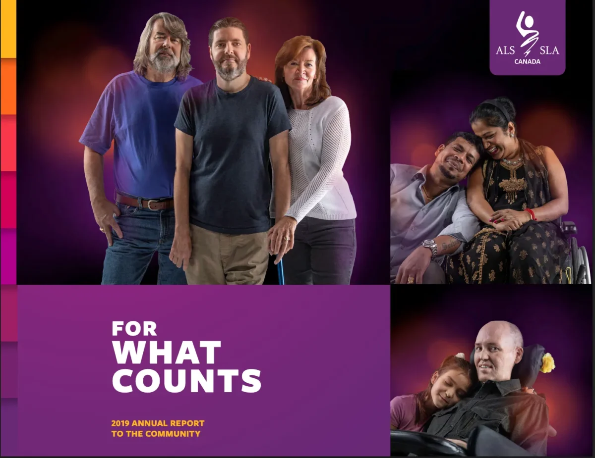
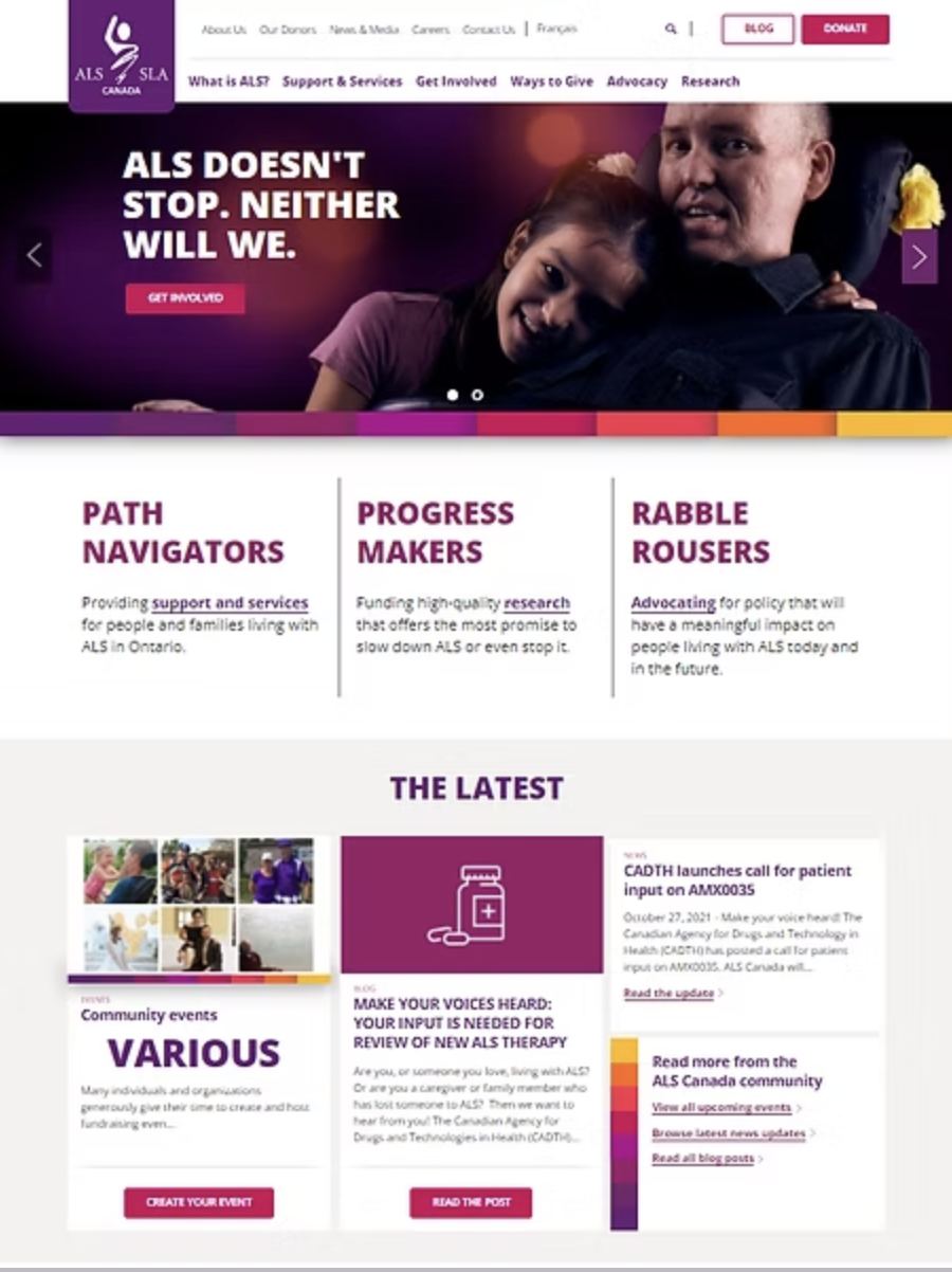
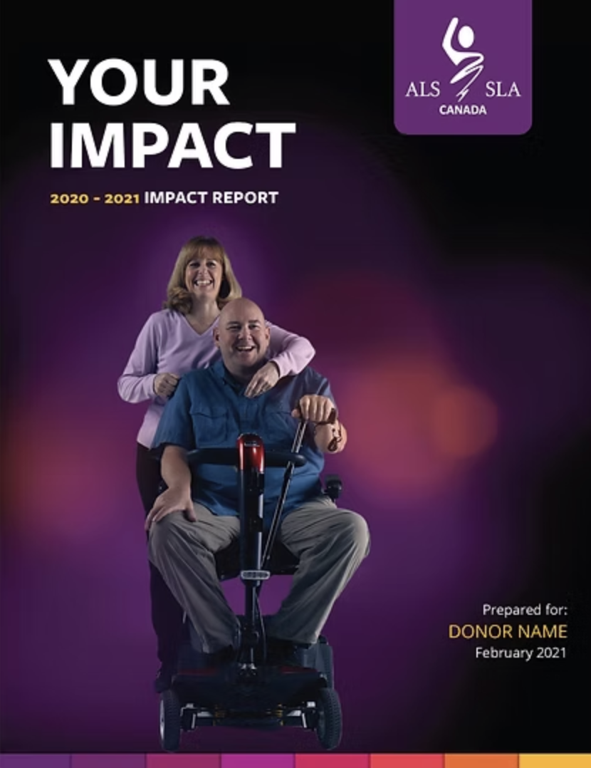
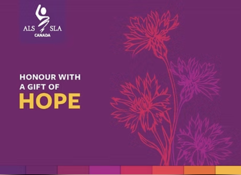
That foundation informed everything: updated personas, a refined colour palette, tone of voice guidelines, photography and videography direction, content templates, design direction across asset types, and swag. The logo icon, shared across all federated partners, wasn’t replaced, but it was modernized: a bold purple chit with rounded edges now grounds the mark, giving it presence without disrupting the federated system.
The most deliberate shift was in community representation. ALS Canada had relied heavily on stock imagery, which meant the people most affected by the disease rarely saw themselves in the brand. Changing that was both a strategic and ethical decision.
The Outcome
The rebrand launched internally first. Because staff had been part of the process, it landed as validation rather than surprise. External rollout was intentional and measured; introduced through the monthly newsletter rather than a campaign, in keeping with nonprofit responsibility around donor perception.
The most meaningful signal came from the community. When the new brand went out, people with lived experience came forward wanting to share their stories. They hadn’t felt moved to before. When a brand signals that your experience belongs here, people respond. That was the intention, and it worked.
Ready to talk about what a brand built for the long term could look like for yours?