The Challenge
When the ALS Society of Canada set out to create a new signature fundraising event, they weren’t just adding another charity ride to the calendar. The cycling fundraiser space is crowded and most events in it follow the same formula: individual fundraisers, mass participation, corporate sponsorship logos plastered across everything. The opportunity was to do something different.
Market research — a targeted survey distributed through community partners, cyclist networks, and cycling groups — revealed a clear audience worth designing for: semi-hardcore cyclists who ride hard, train seriously, and value the camaraderie of people who understand what that takes. This wasn’t the same crowd as solo charity walkers raising money through their office contacts. They had their own culture, and an event brand that spoke to that culture could carve out a genuinely distinct position in the market.
My Role
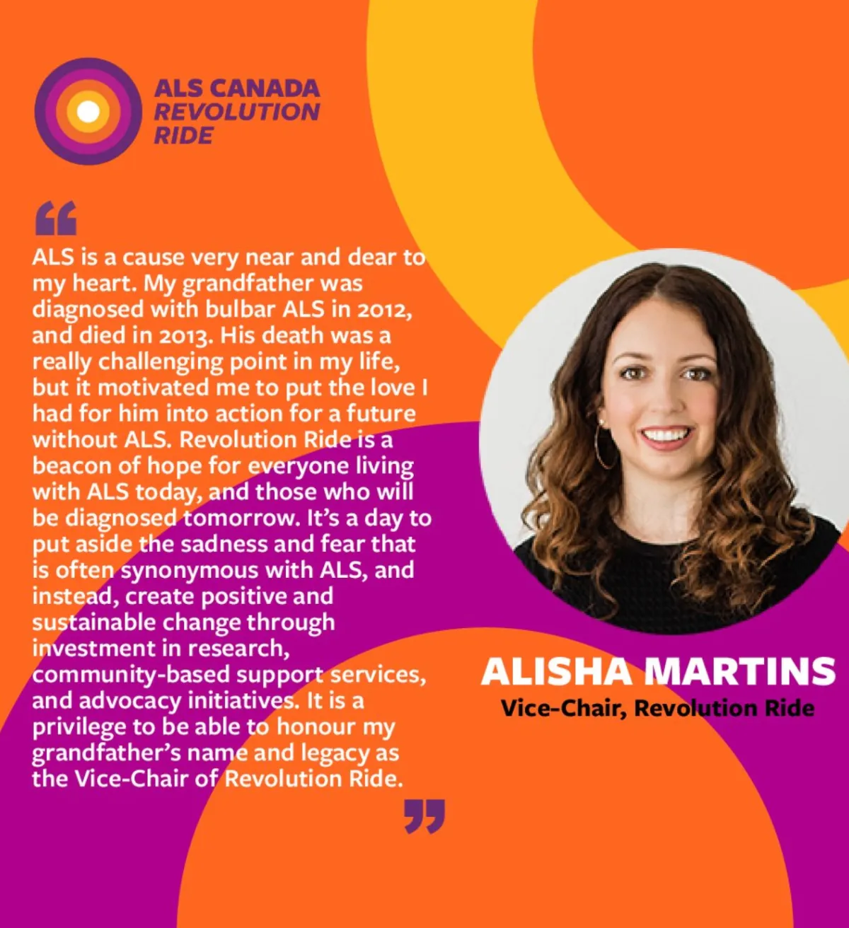
I led the Revolution Ride brand development project throughout 2020, working alongside branding agency B3Strategy. That meant owning the strategic direction, ensuring the event brand had its own distinct identity while maintaining alignment with the ALS Canada master brand, and making a deliberate call to hold off on title sponsorship during the launch phase, protecting brand equity before opening it up to commercial partnerships.
The
Approach
The brand needed to communicate two things simultaneously: the energy and intensity of serious cycling, and the warmth of a community that welcomes people in. Those aren’t opposing ideas, but they require careful calibration.
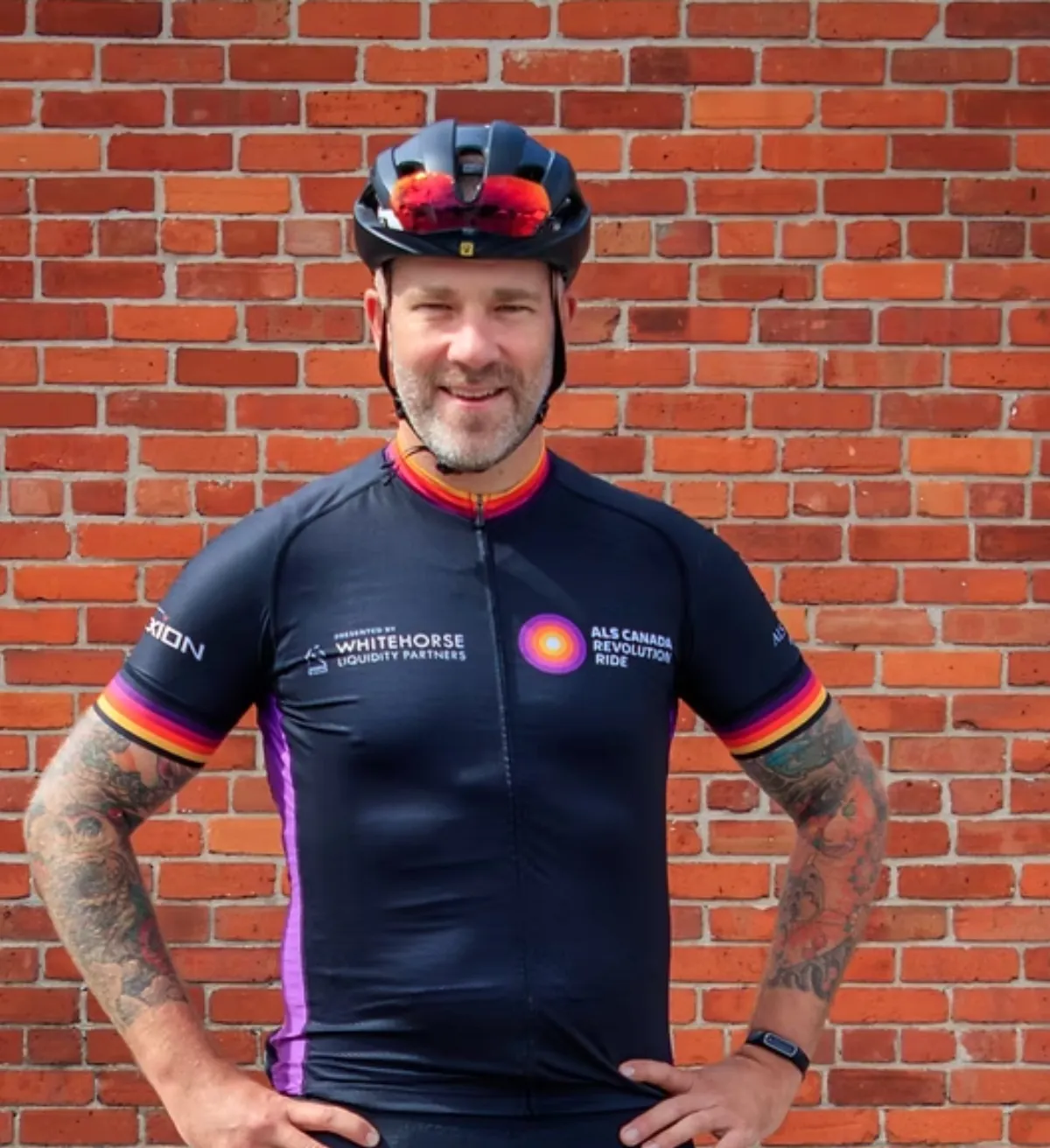
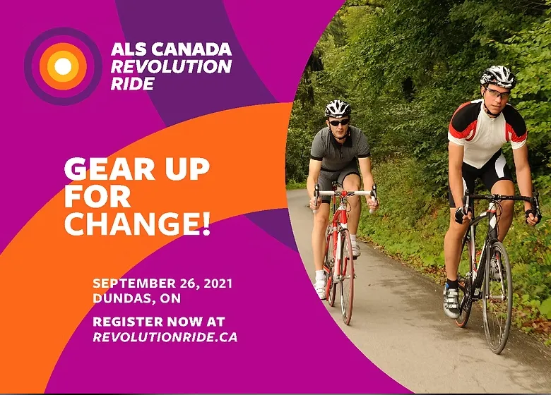
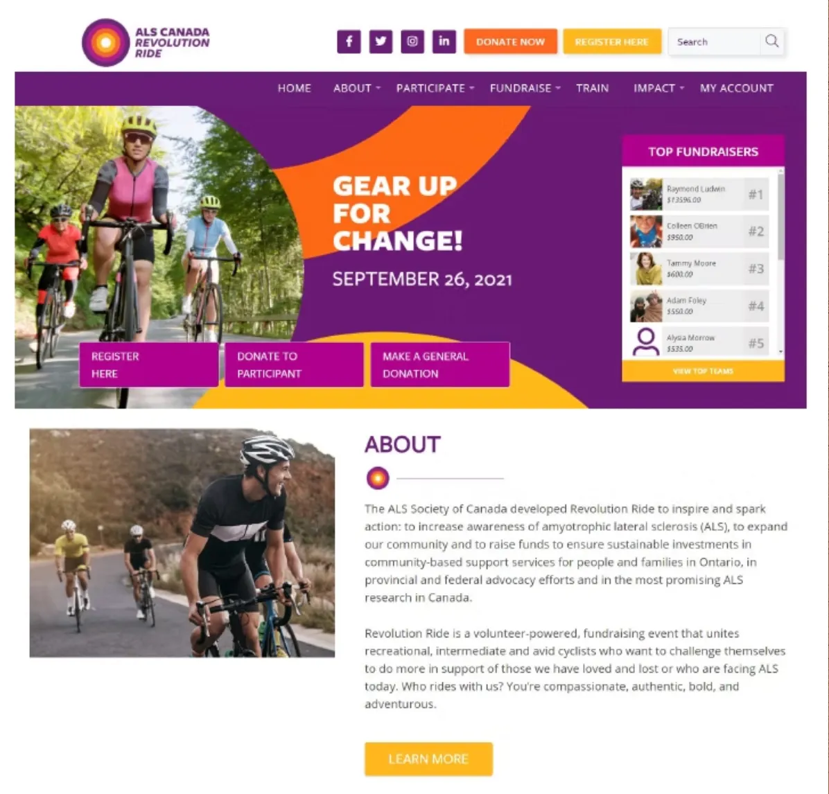
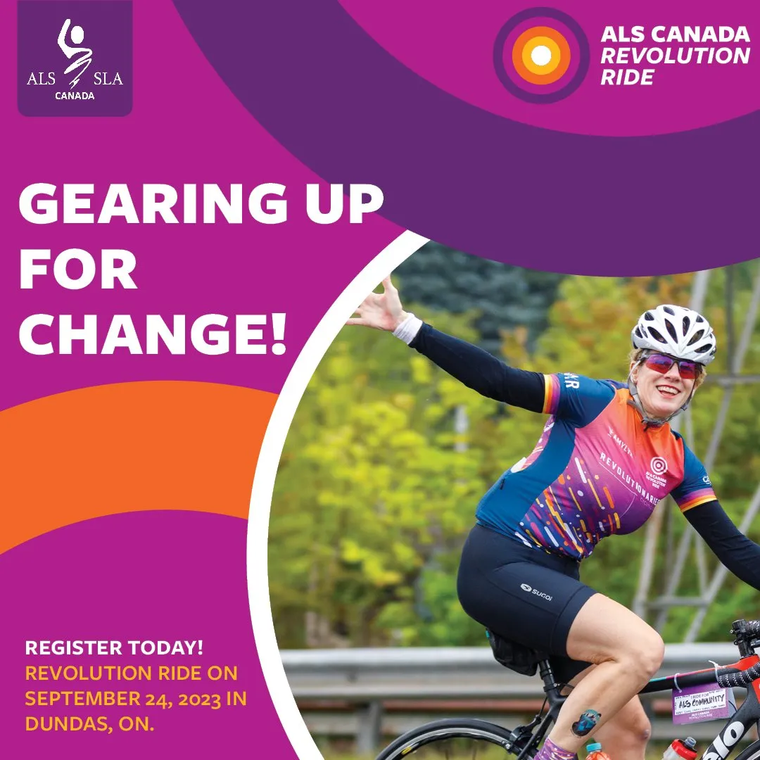
The visual identity was built around movement. The Revolution Ride logo uses concentric circles; a nod to the revolution in the name itself, incorporating the ALS Society of Canada master brand colours while establishing its own bold, energetic personality. Graphic elements throughout suggest motion and momentum. Even the logotype is italicized, a small detail that reinforces the sense of forward movement without saying a word.
The brand deliberately avoided the aesthetic of typical charity event visuals. Photography features cyclists in proper cycling gear, not casual participants in t-shirts, signaling to the target audience that this event was designed for them.
The event experience was built to match the brand promise. Routes were designed to challenge serious cyclists while offering options for ambitious amateurs finding their footing. Stops along the route, on-site bike tuning stations, and a post-ride celebration at a local brewery; pizza, beverages, and the natural decompression of people who just did something hard together, made the community feel tangible, not just a marketing claim.
The Outcome
Revolution Ride launched in September 2021 in Dundas, Ontario. The event was a success from the start and has continued to grow raising over $600,000 for the ALS Society of Canada since its inaugural year. The brand built for launch is still in use today.
Holding off on title sponsorship in year one was the right call. Building brand equity first meant the event arrived with its own identity intact, something sponsors would want to associate with, rather than a blank canvas they’d be helping to define.
Ready to talk about what a brand built for the long term could look like for yours?